Imagine it's 1999 and you want to know whether hormone replacement therapy protects postmenopausal women from heart disease. The literature looks reassuring. The Nurses' Health Study, following tens of thousands of women for a decade, reported that current estrogen users had roughly half the risk of major coronary disease (relative risk 0.56), and a long line of observational studies pointed the same way. Cardiovascular protection was one of the reasons hormone therapy was so widely prescribed.
Then the randomized trials arrived. HERS found that hormone therapy did not reduce coronary events in women with established heart disease, and in 2002 the Women's Health Initiative stopped its estrogen-plus-progestin arm early, reporting a hazard ratio for coronary heart disease of 1.29. The observational studies weren't wrong about their data. Part of the problem was who they were observing: women who chose hormone therapy tended to be healthier in the first place, and adjustment never fully removed that. The answer to "what does the literature say?" had depended on which kind of study you happened to read.
Every scientist asks that question, and the usual tools answer it poorly. A PubMed search returns a list sorted by relevance, in which a mouse study, a case report, a cohort and a 16,000-person trial look identical, and decades of work collapse into one scroll. Today we're releasing Claimscape, a free tool that turns that list into a picture.
One claim, every abstract, one picture
You type a claim in plain language and Claimscape does the rest. It searches PubMed, reads up to 300 of the most relevant abstracts one at a time, decides for each whether it addresses your claim and which way its results point, sorts the papers by study design and plots them by publication date. A map of 200 papers takes about five seconds, and it fills in while you watch.
Here's the hormone therapy claim, "Hormone replacement therapy reduces the risk of coronary heart disease in postmenopausal women", mapped from the 200 most relevant research papers on PubMed. Of the 593 papers the search matched, 129 were on topic and ended up on the map.
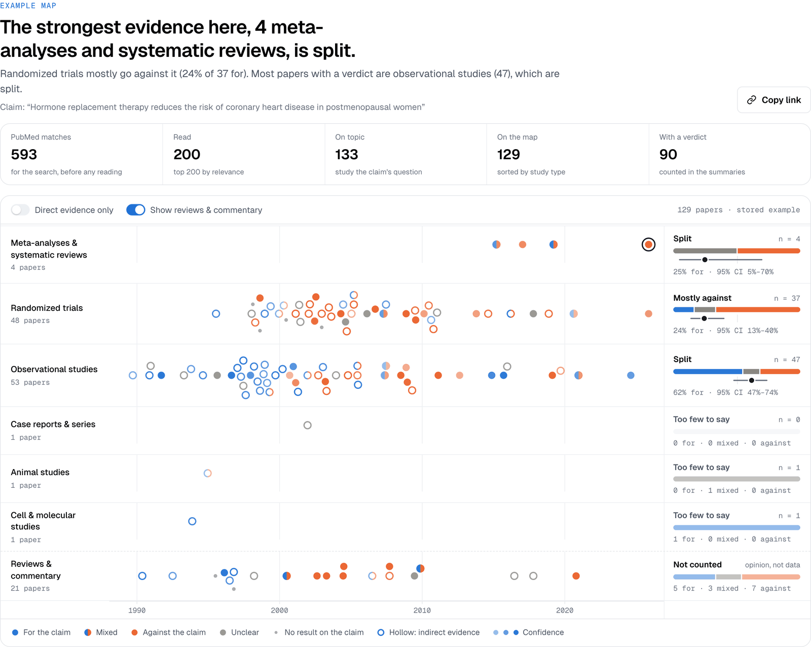
The story from 1999 is right there in the dots. The randomized trials come out "mostly against": only 24% of them support the claim, with a 95% interval of 13% to 40%, and the dense orange cluster between 1998 and 2004 is HERS, WHI and the trials that followed them. The observational studies come out split overall, but look at when they were published. The blue dots crowd the 1990s, and the orange ones mostly come later. No single paper tells you that. The shape of the literature does.
How to read a map
A map has only a few elements, and each one carries a specific meaning. Once you know them, you can read a new map in a few seconds:
- Rows are study designs, strongest first: meta-analyses and systematic reviews, randomized trials, observational studies, case reports, animal studies, and cell and molecular work. Narrative reviews and commentary get their own row at the bottom and are never counted, because they are opinion rather than data.
- Each dot is one paper, placed at its publication date. Blue means its abstract supports the claim, orange means it goes against it, and a half-and-half dot means its results were mixed. Stronger color means a more confident reading.
- Hollow dots are indirect evidence: a different population or species, a laboratory model, or a stand-in outcome such as a biomarker. One switch hides them and recomputes everything from direct evidence alone.
- Each row gets a verdict on the right, from "mostly for" to "mostly against", with the share of papers for the claim and its 95% interval. A row needs at least three papers with a verdict before it gets one; otherwise it says "too few to say".
- The headline is built from fixed rules, not written by a model. It names the verdict of the strongest design that has one, then any design that points the other way, then where most of the papers come from.
Every dot opens its evidence
A map you can't check is just a rumor with good graphics, so every dot opens. Click one and you get the paper's abstract, its verdict as a set of probabilities, where its study type came from, and the single sentence the verdict rests on, highlighted in place. Here's the 2002 Women's Health Initiative trial from the map above.
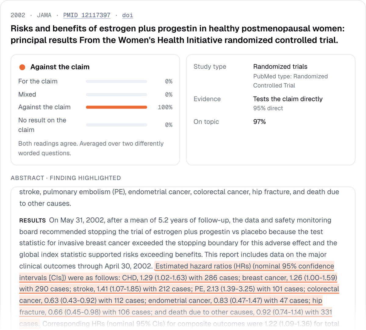
The highlighted sentence isn't a paraphrase. It is chosen from the abstract's own sentences, so the evidence behind a verdict is always text the paper actually contains. The study type says where it came from, here PubMed's own indexing ("Randomized Controlled Trial"), and the verdict panel shows whether two differently worded readings of the abstract agreed. Everything the map concludes, you can trace back to a sentence in a minute.
How it works
Behind each map are four steps. Only the reading step calls an AI model, and it's kept to the questions that genuinely need reading comprehension; searching, sorting and summarizing are plain code.
- Search. Your claim becomes a PubMed search that you can see and edit. Direction words like "reduces" or "increases" are dropped so papers aren't missed for using a different verb. By default the search keeps research papers and systematic reviews and leaves out narrative reviews, editorials and letters. Retracted papers and retraction notices are removed before anything is read. If PubMed doesn't recognize a term, which usually means a typo, Claimscape stops and offers PubMed's own spelling suggestion instead of quietly mapping a different question.
- Read. Each abstract is read on its own, with your claim beside it, by Jev, the decision model from TypeSafe that also powers Rigor Scan. Jev doesn't write prose. It answers typed questions with probabilities. Is the paper on topic? Which way do its results point? That question is asked twice, in different words, and if the two readings disagree the paper counts as unclear. Does it test the claim directly? What kind of study is it? And which of its own sentences states the finding?
- Sort. Where PubMed's indexers have assigned a clear publication type, such as "Randomized Controlled Trial" or "Meta-Analysis", that decides the row. Otherwise the model's reading of the abstract does, and the page tells you which.
- Summarize. A paper's verdict counts only when both readings agree and the top answer reaches 60%. Each row's share for comes with a Wilson 95% interval, so a row of four papers looks as uncertain as it is.
Every question, threshold and rule is published word for word under How the map is made, and you can copy the whole method as JSON. The method is versioned, so maps can be compared within a version.
Three more maps
The tool opens with four worked examples, and a few more claims show what the maps are good at. Each map below has a link that opens it live in the tool.
Metformin and lifespan: an evidence base that lives in animals
"Metformin extends lifespan" is one of the most discussed claims in aging research. Its map shows why the discussion hasn't ended, and what it would take to end it.
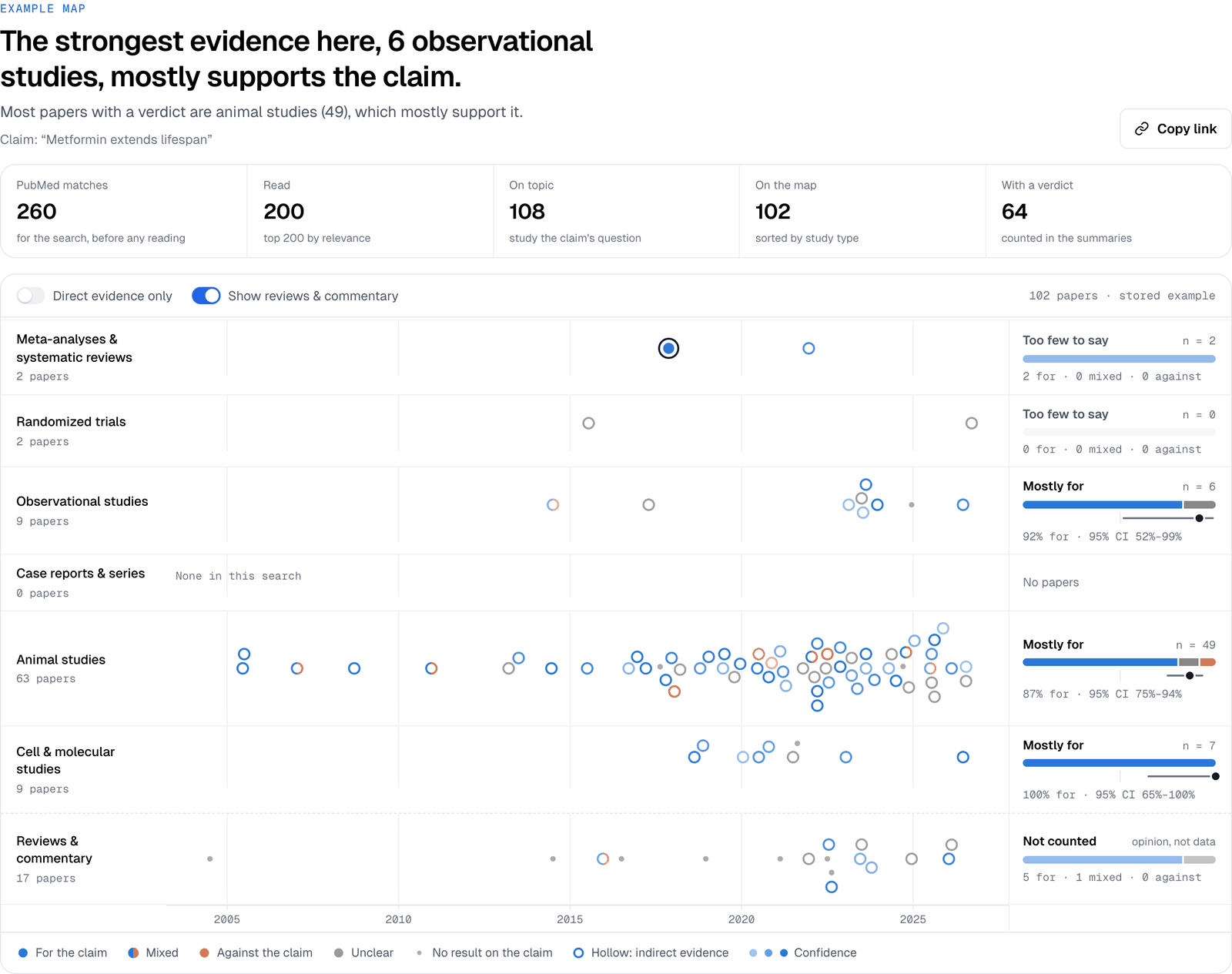
The support is real: 87% of the animal studies with a verdict are for the claim (95% interval 75% to 94%). But almost every dot is hollow, because the lifespan being extended belongs to worms, flies and mice. The two randomized trials in people have no verdict on lifespan at all. The map doesn't say the claim is false. It says where the evidence for it comes from, and it points straight at the study that's missing. (Open this map.)
MMR and autism: a question the evidence has settled
Some claims have been tested so thoroughly that the map is almost one color. "The MMR vaccine causes autism" is one of them.
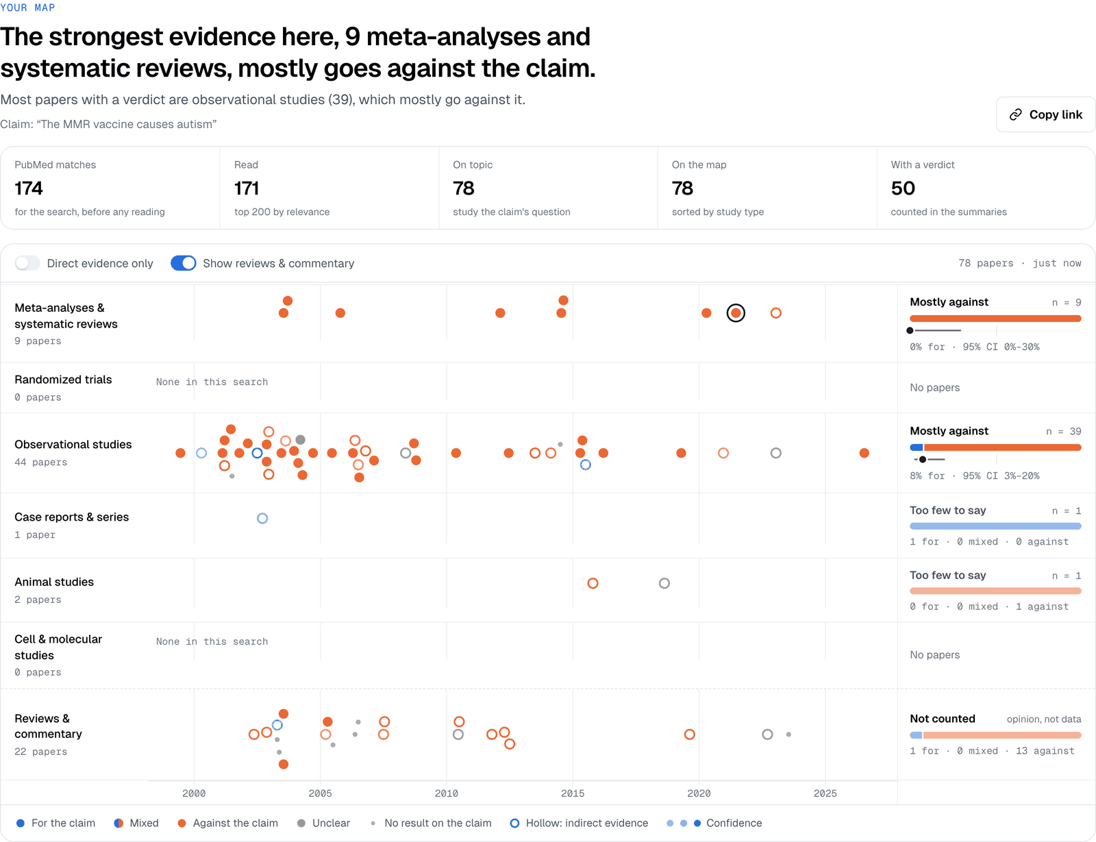
All nine meta-analyses and systematic reviews go against the claim (0% for, 95% interval 0% to 30%), as do the observational studies (8% for), including the Danish cohort of more than half a million children. The randomized trial row is empty, which is itself informative: nobody randomizes children to go unvaccinated. And the 1998 paper that started the scare never reaches the map. It was retracted, so Claimscape removes it before reading and lists it among the papers left off. (Open this map.)
Hydroxychloroquine: what changes when you change one word
The most useful thing about Claimscape may be how quickly it answers a follow-up. Map "Hydroxychloroquine reduces mortality in patients with COVID-19", and the randomized trials, including RECOVERY, come out 0% for. Now change "reduces" to "does not reduce". The search is unchanged, so Claimscape keeps the same papers and reads each one again against the new wording.
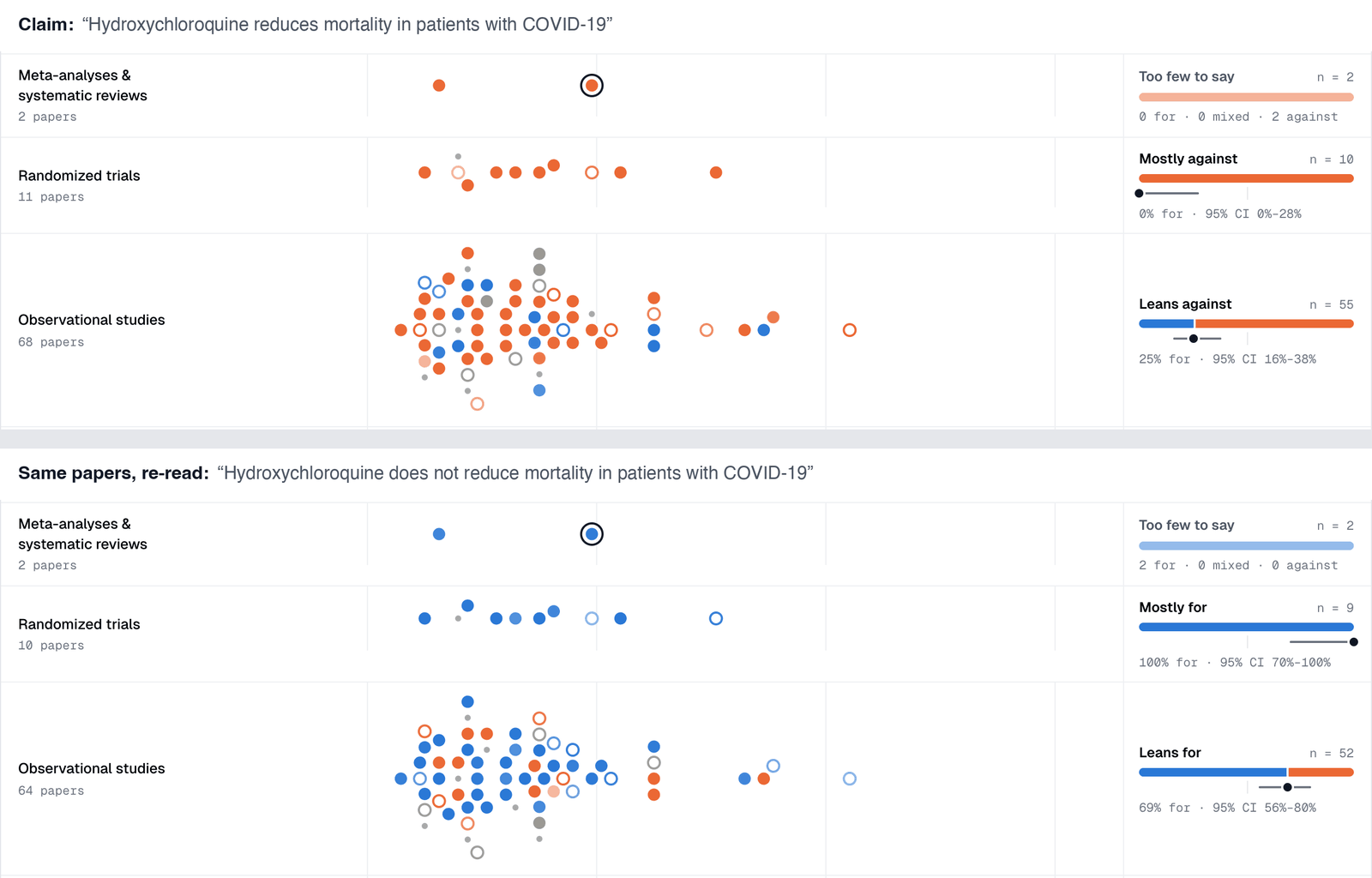
The trial row turns from orange to blue, and that's the right answer. A trial that finds no benefit is evidence against a claim of benefit and evidence for a claim of no benefit. The observational row shifts too, from leaning against (25% for) to leaning toward the new wording (69% for), because the observational literature was more mixed. Watching a map re-read itself is a quick way to see how much a verdict depends on exactly what you ask. A retracted hydroxychloroquine trial was removed from this map before reading, too. (Open this map.)
What you can use it for
We built Claimscape for the moments when a scientist needs to know where the evidence stands, fast, without committing to a full systematic review. A few of the uses we had in mind:
- Before you write an introduction, a discussion or the significance section of a grant, so the premise you cite reflects the whole literature and not the one study that suits it.
- Scoping a review. A map shows how big a literature is, which designs it contains and where the gaps are, such as a claim resting on animal work alone, before you spend months on a protocol.
- Reviewing a manuscript, or a press release, when a claim in the discussion sounds stronger than you remember the field being.
- Deciding what to run next. If the direct human evidence is thin, that's the experiment worth designing.
- Journal club and teaching. The hormone therapy map is a better lesson in the evidence hierarchy than any slide about pyramids.
When the map raises a question that abstracts can't answer, the next steps are one click away. The "Take it further" panel builds a brief for K-Dense Web, our AI co-scientist, with the claim, the search, each design's verdicts and every PubMed ID on the map. It then lets you choose what K-Dense Web should do: check each verdict against the full text, extract effect sizes, pool the randomized trials in a meta-analysis, assess risk of bias, search beyond PubMed, or write a structured evidence summary.
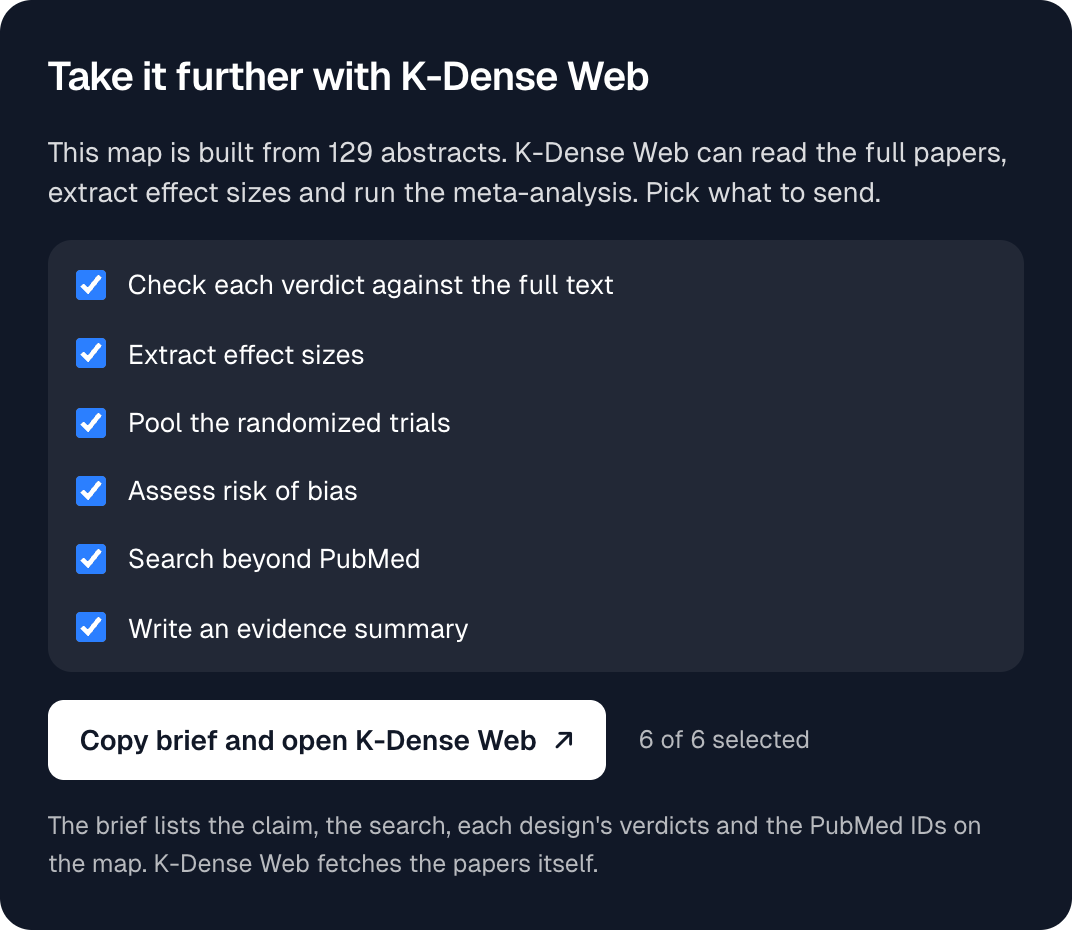
The brief is assembled from fixed templates, so nothing in it is generated. It also tells K-Dense Web to treat the abstract verdicts as a starting point rather than as findings, which is exactly how we think they should be treated.
How far to trust it
We tested Claimscape on a dozen claims with well-known answers before releasing it, from statins and cardiovascular events to vitamin C and the common cold. The landmark papers were read the way a specialist would read them. The Nurses' Health Study came out for the hormone therapy claim, HERS and WHI against, and RECOVERY against hydroxychloroquine, and the retracted papers were caught before reading. In a hand audit of 32 randomly chosen papers, we agreed with 24 of the 25 directional verdicts. The one disagreement was a meta-analysis read as "mixed" that we'd have called "for". Across the claims we tested, the two readings of each abstract agreed for 88% to 99% of papers.
It still has limits, and they're worth knowing before you rely on a map. Most of them come from reading abstracts rather than papers:
- Abstracts only. An abstract can overstate or understate what a paper found, and results that appear only in the full text are missed.
- Every paper counts once, whatever its size or quality. A pilot study and a large trial make the same dot, which is why Claimscape is not a meta-analysis and never pools effect sizes.
- Publication bias comes first. The published literature over-represents positive results before anything is read.
- The search shapes the map. Claimscape reads the papers PubMed ranks as most relevant, so check the search it shows you and refine it when needed.
- Claims are read literally, including scope words like "in older adults". Plain, positive statements work best.
Every one of these is also stated on the tool page. And because every dot opens its evidence, a map is always something you can check rather than something you have to take on trust.
Try it
Claimscape is free and needs no account. It opens on the hormone therapy map, with chips for the anesthesia, vitamin D and metformin examples, and any map you make has a link you can share. It pairs naturally with Rigor Scan: Claimscape shows where a literature stands, and Rigor Scan checks how completely any one paper in it reports its methods.
Try a claim from your own field, the one you've always suspected rests on weaker evidence than people think. If a map surprises you, or you think it got a paper wrong, we'd like to hear about it at contact@k-dense.ai.